A design walk-through of Cinnamon Life with James, from a first sketch rooted in Sinhalese guardstones and moonstones to the five-storey sun in the lobby.
“Paint still on his fingertips. Sketches still in his pocket.”
● Daily Mirror · Interview
Architectural alchemy.
The magic and the method of designing Cinnamon Life: James on first sketches, animate architecture, the façades and Cecil Balmond’s vision.
“The moment is like a Big Bang, creating something from nothing.”
● ARTRA · Art & Living · Essay
Seeing with new eyes.
James on the conceptualisation to construction of the public commission, The Lotus (WTC, Colombo): what you can’t see when you look at a sculpture.
“We had to do more. We had to escape gravity.”
● ARTRA · Oct/Nov 2020 · Thought piece
How does art & design enrich your home?
James and ARTRA editor-in-chief Azara Jaleel on why art, design and space should no longer be treated apart, what a work of art does for daily life, and a practical turn to the kitchen floor.
“If the walls are the body, the art is the soul of it.”
● The Sunday Times · Plus
Universal creative: a whole new world of designing.
James at the Academy of Design’s Design Katha series, on why creativity belongs to everyone and how ideas travel between disciplines.
“The death of discipline. The rise of the universal creative.”
● Wallpaper* · Corporate design & branding
Balmond Studio launches a new brand identity.
The in-house rebrand James led as creative director: a rhombus logo, black, yellow and white, Ammann tiling and algorithmic patterns.
“Different people. Different markets. Same message.”
The Sunday Times · Plus · Talk
Universal creative: a whole new world of designing.
James’s Design Katha talk to Academy of Design students and designers in Colombo: creativity without borders between disciplines.
18 February 2018 · Featured in The Sunday Times Sri Lanka by Tera Jayewardene
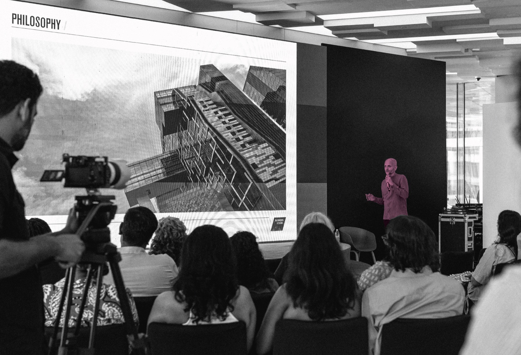
In February 2018 James spoke to a packed room of Academy of Design students and designers as part of AOD’s Design Katha series. The title of the talk set the tone, and The Sunday Times’ Tera Jayewardene opened her report with a small detail that summed it up: James’s business card is a parallelogram.
“The death of discipline. The rise of the universal creative.”
Creativity is for everyone
James’s starting point is that creativity is in all of us, whatever our age or job. Rather than treating it as making something out of nothing, he argues for a wider, more fluid definition: breaking with habits, rules and patterns to arrive at new ideas, forms and methods. Even reorganising a drawer differently counts.
From copywriter to creative director
The piece traces his route from copywriting into art direction and agency creative direction, before joining Balmond Studio, where he oversees the brand, strategic design development, the interior design department and the studio’s intellectual property. Along the way he has worked with Nike, Disney, Louis Vuitton, Nissan, Puma, Nando’s, Starbucks and Toyota.
Solving problems is a creative act
He shared three examples. For a Toy Story of Terror campaign involving Disney, Pixar and Sky, he proposed a shared online platform so every partner could work from the same guidelines in real time. For Louis Vuitton at a Tokyo expo, he showed no product at all, building a sculpture from a manufacturing technique with intelligent lighting instead. For Puma, the team listened to footballers’ own stories and told them through sand art with the winner of Ukraine’s Got Talent.
Scale without borders
Methods, he argued, don’t belong to one discipline. A form generated from mathematics can shrink from architecture to an interior, and the script behind a monumental public sculpture in Los Angeles became a line of jewellery.
Building a culture of universal creatives
Inside a studio, that means people knowing what other departments do, roles that can stretch and grow, open platforms for ideas, and an inclusive atmosphere where everyone is invited to contribute. The pay-off, he told the students, is people who feel more valued, take more ownership and deliver better work.
A summary of “Universal creative; it’s a whole new world of designing” by Tera Jayewardene, The Sunday Times Sri Lanka, 18 February 2018.
Wallpaper* · Corporate design & branding
Balmond Studio launches a new brand identity.
The studio’s in-house rebrand, led by James as creative director: one identity for a growing global network.
Featured in Wallpaper* by Ali Morris
Wallpaper*’s Ali Morris covered the launch of Balmond Studio’s new identity, designed in-house as the practice grew. Six years after Cecil Balmond left Arup to found it, the London studio was working across architecture, consulting, interiors and public and fine art, with major projects including a large waterfront development in Colombo and a stainless-steel public sculpture in Los Angeles.
One message, everywhere
James, creative director since 2014, explained the aim as consistency across a global network of staff, partners and collaborators, so that everyone knows who the studio is, how it works and what it expects.
“Different people. Different markets. Same message.”
Geometry as a brand
The identity is built on black, yellow and white and a new rhombus logo. Paired with Ammann tiling, its angular forms point to the geometric investigation behind the studio’s design approach. Sketches, renders, fractals and patterns are layered through it as branded elements.
Algorithms on the cover
Swirling algorithmic motifs soften the hard edges on the brochure covers, a nod to the studio’s use of generative algorithms to create structure and its research into non-linear systems. As James put it, the studio’s own design methodology sits at the heart of the brand.
Phase two
The rebrand was set to roll out across every office and platform, as the first of two phases. The second, James promised, would push visual boundaries and production techniques much further.
A summary of “Fix up look sharp: Balmond Studio launches new brand identity” by Ali Morris, Wallpaper*.
ARTRA · Art & Living · Essay
Seeing with new eyes.
James Balmond on the conceptualisation to construction of the public commission, The Lotus (WTC, Colombo).
By James Balmond
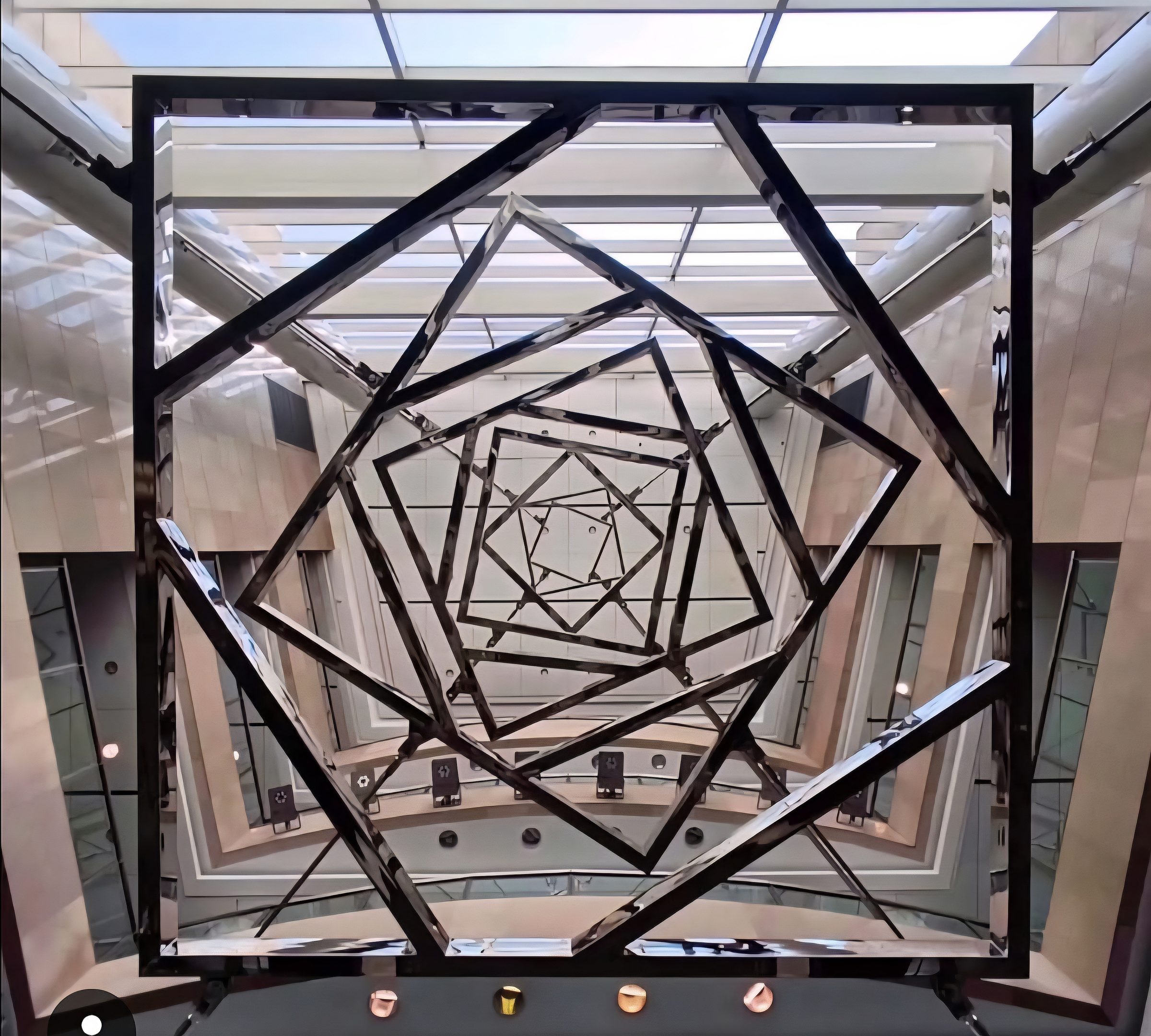
Lotus, World Trade Center, Colombo
I find the Art and Living concept extremely fascinating. The existential and the abstract collide with infinite consequence. I could never unravel this intricate tapestry of engagement. But I can examine the importance art plays in my own life. And through my own experience, share some thoughts on art’s position and role within the everyday.
Before members of the subfamily Coronavirinae paralysed conventional existence, I would often go to the World Trade Center to visit Lotus – our public sculpture. While most people were engaging with visible aesthetic, I quickly realised that I was seeing something different.
The creator, in my opinion, observes a picture born from the totality of experiences inherent within the artistic project. Gazing at those ascending stainless steel frames I see an abstract sketch, computer code, the behavior of load bearing columns, tax increases on metal imports, lateral suspension mechanics, axial forces, late night debates on artistic integrity versus practicality…I could go on.
Lotus was an extremely challenging project. Yet looking at the piece, one cannot see the processes behind it. I want to discuss this hidden world. More specifically how conceptual thinking determined executional outcome.
From the start, the WTC tower cast an omnipresent shadow over conceptual development. We were confronted with an 8 x 8 m floor area and a massive 5 level void rising to a height of 22.5m in total. Looking up into that cavernous space, my instinct was clear: we must fill the entire void. Anything else and the sculpture would be mere externality – an insertion that would, if anything, only re-emphasis the vast expanse of the atrium above.
We had to do more. We had to escape gravity.
We had to do more. We had to escape gravity. So to fill the void, in this instance, was about a sequence of structural moves in space. We couldn’t have a fixed creative singularity – an omnipotent point from which the piece would radiate and yet always return. This ruled out a bottom-fixed or top-hung approach. Ideas flew back and forth. Lateral suspension emerged as a means to an unknown end.
The brief was simple: to bridge the cultural gap between past and present. We decided on a contemporary interpretation of a traditional Sri Lankan symbol – the Lotus flower. This choice ticked a lot of our predetermined parameters.
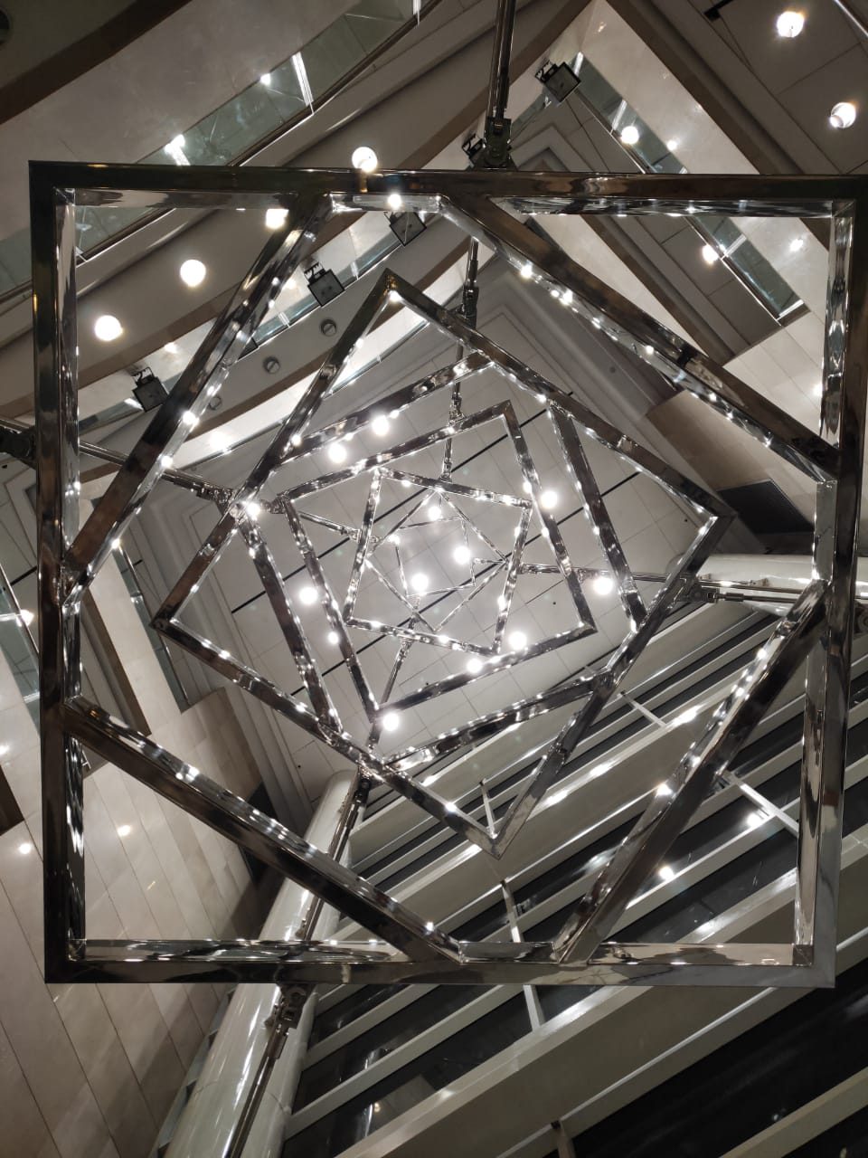
A mathematical principle determines the arrangement of a Lotus flower’s petals. So we had our autonomous design system. But we had to simplify things to make it work. Basically we reduced down to the abstract – a repeating algorithm of a freely moving point running from a ½ to a ⅓ distance along the adjacent lines of a square. Repeating the algorithm, and connecting these points, produced an ever more detailed set of fractures. These areas became the folding petals of a Lotus flower in plan.
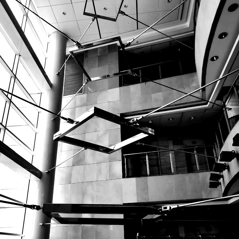
Next we had to break free from the inertia of two dimensions. So we ‘pulled’ each algorithmic layer into three-dimensional space. Animate geometry was at work – a series of virtual ‘frameworks’ emerged one on top of the other. We would fill the void with 7 individually orientated structural frames to form our Lotus petal arrangement. Each frame would be supported with customised lateral suspension mechanisms.
Lotus, World Trade Center, Colombo
At this juncture, things become philosophically and technically intriguing. The full integration of large-scale sculptural structures into the building introduced a new set of data variables within pre-existing and interdependent design systems. In this realm, the laws of physics, rather than aesthetics, ruled supreme. Artistry and structural engineering were on a collision course.
Firstly, every artistic decision had a consequence for the building. The sculpture’s mass, thickness, material composition, lateral suspension points and frame positioning could alter the existing balance of forces, stresses and pressures at work within the tower structure. This in turn would drastically alter the performance of each engineering solution. And we all know what that implies – warping, buckling, bowing…even collapse. Essentially art could never trump structural integrity.
Secondly, the building’s ‘active’ behaviour and characteristics were affecting artistic decisions. For example, we had to consider how the natural movement of the tower structure would affect our suspension system and adapt it accordingly. On a smaller scale, even something as simple as atrium temperature fluctuation would determine material and material finish.
Thirdly, when one removes artistic intention from Lotus, we are left with pure structure. Structure, in this instance, meaning an arrangement of interrelated functional elements. To put it differently a bolt is just a bolt – a mechanical fastener with a threaded shaft designed to keep things in place. It has no aesthetic purpose in the artistic sense. Rather it is specifically designed for optimum functionality. How could we safeguard artistic outcome while simultaneously using structural components designed for function?
Art, engineering and architecture were in a constant fight for dominance.
Art, engineering and architecture were in a constant fight for dominance. Therefore fluidity of thought was vital. With every action, I had to create a new hierarchy of intention based on the existing causational relationships between these interactive entities. This process repeated lead to an accumulation of executional outputs for Lotus.
Each structural frame is supported with four stainless steel tensioned rods. And each rod is anchored to the four circular columns of the main building structure. Going deeper, every hanging rod possesses two pin-head movement joints. These joints allow for both the vertical and horizontal shifts of the sculpture, as well as the absorbing of jerks and movements from the principal tower structure.
Transitioning into the aesthetic, the uniformity of the lateral suspension mechanisms was vital. This was problematic as the lower frames weighed more than the upper frames. Our solution lay in varying the tension rod sizes in proportion to material mass.
We also had to hand-finish the fastening elements at the tension nodes. Reflection was an experiential necessity. In order to create this effect, whilst simultaneously withstanding the atrium’s environmental conditions, Lotus is made from durable Stainless Steel 316L with a high gloss mirror finish. We wanted to further explore reflection with artificial light sources. So at night, a high power and fully programmable WRGB colour-changing LED floodlight system creates a vibrant visual display of colour, structure and situational context.
Seven frames, each held by four tensioned rods
What conclusions can one draw from this rhetorical journey? Art possesses an inherent duality. Process and end manifestation co-exist, yet the former is predominantly hidden from the public. For Lotus, it is the interaction between the architectural, engineering and artistic paradigms that makes the piece (and process) unique. And this is just one example. Every piece of art, on any scale, has a rich and engaging subtext, demonstrating both the pleasure and pain of the artistic process. So the next time you are looking at a sculpture, installation or painting, you will be seeing with new eyes, appreciating the invisible endeavor beyond the surface.
First published in ARTRA (Art & Living).
ARTRA · Oct/Nov 2020 · Thought piece
How does art & design enrich your home?
On art, design and daily life, and turning your kitchen floor into something more.
By James Balmond, Creative Director of Balmond Studio & Azara Jaleel, Editor-in-Chief of ARTRA
Orion City, Colombo – Balmond Studio interiors
To create is to be human. Consequently both art and design are extremely significant. Not only does the creative act arguably satisfy some kind of spiritual prerequisite, thus enriching (and by default) re-affirming our very identity and humanity within an existential context. It simultaneously improves our environment, therefore enriching the physical and, as a consequence of the process, the experiential by proxy.
Traditionally art and design have been seen as two different aspects, neatly contained within their respective disciplinary paradigms. The former is defined by functionality, the latter by aesthetics or non-functionality. The opposition summarised in the famous axiom ‘form follows function’. However, this binary perception has been eroded over time, with clear distinctions of discipline becoming more and more tenuous as the years have progressed. The Glaswegian architect, designer and engineer Charles Rennie Mackintosh was one of the champions of this interdisciplinary fusion – labelling it integrated art-architecture. He was a firm believer in the pure integration of form and function, advocating the theory of ‘The room as a work of art.’ In other words every detail, from structure to furniture and fixtures, works together – contingent parts forming a universal whole. Or to use Frank Lloyd Wright’s words ‘form and function are one.’ The philosophy permeates both the conceptual and physical core of the Guggenheim as he wanted both the building, and the art contained within, to exist in a ‘beautiful symphony’, a harmonious inclusive balance void of any metaphorical distinction.
We need to take this thinking and apply it to our homes. So we should no longer distinguish between art, design and space per se. Rather it’s more about adopting a holistic approach, dissipating distinction and focusing on the objective totality. We aren’t simply ‘designing’ or making ‘artistic’ interventions within an external space. In fact we’re taking a series of creative actions that affect and define the nature of space, culminating in an enriched experience. Moving forward, when using the terms art and design in relation to the home, we will be placing both disciplines under the umbrella of ‘creativity’ meaning they are synonymous and interchangeable. This reinforces and emphasizes the overlap and universal qualities both possess from a philosophical, conceptual and practical perspective, rather than their differences.
As previously mentioned, art and design can enrich your home and life. In summation they can have a positive effect on an individual’s psychology, self-identity and existential sense of being, as well as enriching the physical environment itself. To increase argumentative clarity we will be analyzing these two processes in isolation. However all four elements – art, design, consciousness and home – are intertwined, affecting and feeding back into each other. This is because space exists in relation to us, a balanced nexus of function, form, aesthetics and spirit. For example, a certain colour could improve a space by making it feel bigger. This is obviously physical enrichment. However, the colour is in fact, the aesthetic catalyst for a new causal chain of stimulus and response within our brain. Essentially we see this colour and how it affects the environment (stimulus), and we then react psychologically to the space (response). In this case, we see the big white room and feel a sense of freedom, calm and comfort. This modality can also be reversed. Using the same example of a colour inclusion, perhaps you choose a colour to trigger a particular emotive response. You will now interpret the space within this emotive framework, so the environment takes on physical characteristics determined by this particular emotion. The starting stimulus and flow of these cause and effect networks always changes. Often there are many running simultaneously. A beautifully complex way of how we make sense of the world around us.
Orion City, Colombo – Balmond Studio interiors
How can a work of art stimulate your home and daily life?
Works of art enhance the quality of life. When frequently engaged with, be it in a private or public space, they expand one’s appreciation of culture and the consequential intellectual stimulation as one views them intently, prompting multiple interpretations; be it personal, social or even political. In fact, in a home setting, art offers hosts and guests chances for added elements of interactions encouraging meaningful connections that trigger riveting conversations, whilst also functioning as a creative source of reducing strain by provoking inner calm.
Art is meant for many things and inside your home, art is meant to evoke your emotions. Choosing the type of art you want to display in your home not only speaks of your personality but also where you come from, and the copiousness of the history and culture of your country, or values and beliefs. While art can simply be means of interior design to some, art on your wall can more importantly be a means of your life’s reflection connected to that of your past, while the intertwining of the artist’s narrative interlinks to create a unique interpretation.
If the walls are the body, the art is the soul of it.
Living with art on your walls means, you chose to live with your extended personality. Art is influential in the way it translates into an experience that broadens knowledge, strikingly highlighting the grandiose vision of the artist. Art doesn’t expire, it renews, and grows across generations, with offspring learning of stories through the times of their ancestors. By enriching your walls you are enriching your life. If the walls are the body, the art is the soul of it. Imagine your living room having a figurative work of art, your bedroom with a vivacious abstract work, your dining room with a charming landscape and bathroom filled with romanticism. Each wall in your home will be different in style possessing its own individuality, its own stories and emotions thereby collectively defining its extended character.
Top tips in designing the kitchen: turn your kitchen floor into something more
The floor is always there. Unassuming and quiet, it grounds us all. We walk on it. Create on it. Live on it. Our very existence played out on a barrier breaking gravity’s grasp. And yet for the average person in the modern world, something so significant is often overlooked or just not really considered. The floor does its job in any space therefore we take it for granted. However your floor is alive with aesthetic and functional possibility.
Shifting from philosophical thought to practical design, the world of flooring is teeming with variety. It’s a diverse landscape of different materials, colours and patterns. Each flooring option has a set of aesthetic and functional pros and cons. This reality is just as valid when it comes to kitchen flooring. To hone our focus, we will be concentrating on tiling and hardwood flooring in your kitchen – offering an overview, style and visual considerations as well as functional qualities.
What can you expect from tiling in your kitchen?
On reflection, tiling appears to be a natural choice for the kitchen space. It is durable, easy to clean and (most importantly) water and stain resistant. These properties are so beneficial especially when dealing with water and food spillages that occur often in the kitchen. From a visual standpoint, tiling offers a myriad of styles, colours and shapes. This gives you so much customisation and control over the look you want to achieve.
There are some other factors you need to be aware of when it comes to tiling. Generally it provides an extremely hard surface with minimal energy absorption. So if you drop glasses or dishes they will break on impact. A tile in itself is fairly durable (depending on the material) however the grout between the tiles can accumulate dirt over time so it must be maintained. You can use a grout sealer when necessary to keep your tiling and grouting looking immaculate. Tiles are also slippery when wet, so hidden spillages during cooking or a drying floor after cleaning may be a little hazardous.
Aesthetic considerations of kitchen tiling: 1. Colour
As mentioned previously, a floor in any space is an integral part of your conceptual ‘foundation’ pertaining to any creative design choices. So when contemplating your kitchen tiling colour you need to think big picture. Your floor should complement and match the entire room and not just your backsplash or secondary wall tiling. Factor in any appliances, cupboards, accent colours and worktops into your colour decision-making process. If you have a pre-existing style or colour scheme, the floor needs to bring everything together, encompassing while simultaneously balancing your chosen aesthetic.
Most kitchen floor tiling is extremely durable meaning that it will stand rigors and tests of time. Consequently neutral colours are ideal, as they tend not to really age looks-wise and go out of style as the years progress. Neutral tones can also help to augment other colour accents and design features within your kitchen, drawing the initial focus elsewhere, at least initially, before the secondary visual layer of flooring becomes more apparent. The reaction between tiling colour and natural light is another dialogue to consider in your kitchen. If you have a large amount of natural light penetrating the space, then you can use that to your advantage, choosing lighter colours that will reflect this light and make the room feel larger. If you have a larger kitchen but less natural light, darker tones (that absorb light) can be used to help ‘contain’ the space making it feel slightly more compact.
2. Size and pattern
To use a musical analogy: if tiling colour is like a chord setting an emotional tone, tiling size and pattern is the rhythm of the composition, creating a kinetic and dynamic energy. To understand why this is so, we need to have a good grasp of the idea of tessellation. Tessellation of a flat surface is a covering using one or more geometric shapes (in this instance tiles) with no overlaps and no gaps. It is a system of repeated pattern where we take the individual unit and repeat it over and over again to form a bigger total surface. The tiles exist in syncopation, each one is like an individual drum beat and together they form a rhythmic pattern. To think of tiling in this way should open up new creative horizons for you in your kitchen.
There are all kinds of sizes and shapes to choose from, and an individual tile follows a modular pattern for each square meter. The tiles come in different dimensions and the size that you select will affect the perceived size of your kitchen. If your kitchen is small, then you should use wider and longer tiles to make the floor simpler and the surrounding space appear bigger. In a larger kitchen you can use thinner and smaller tiles to create a contrasting visual texture to the bigger surrounding spatial volume. Or if you wish to re-enforce the larger kitchen size, choose larger tiles as this gives a lower tile quantity hence ‘opening up’ the floor. It’s also worth bearing in mind that the size of your kitchen floor tile determines the amount of visible grout lines. Fewer grout lines create the illusion of more space, so again bigger tiles in smaller kitchens is a smart design idea.
First published in ARTRA Magazine, Oct/Nov 2020 (E56).
ELLE Decor India · Architecture
Colombo’s new icon of architecture and art.
A stay at Cinnamon Life, City of Dreams, and a design walk-through with James: from a sketch of Sinhalese guardstones to a five-storey sun.
28 May 2025 · Featured in ELLE Decor India by Yashika Punjabee
In May 2025, ELLE Decor India’s Yashika Punjabee spent a few days at Cinnamon Life, City of Dreams: South Asia’s largest integrated resort, with 687 rooms and a dozen restaurants on the Colombo waterfront. Her piece reads less like a hotel review than a portrait of a building with a story to tell, and much of that story starts with Balmond Studio.
Where the form comes from
She joined James and the Balmond Studio architects for a design walk-through. James framed the interiors as an expression of life’s energy, its pulse and its constantly shifting rhythms, organised into a system of patterns and prints that runs through the lobbies and ballrooms.
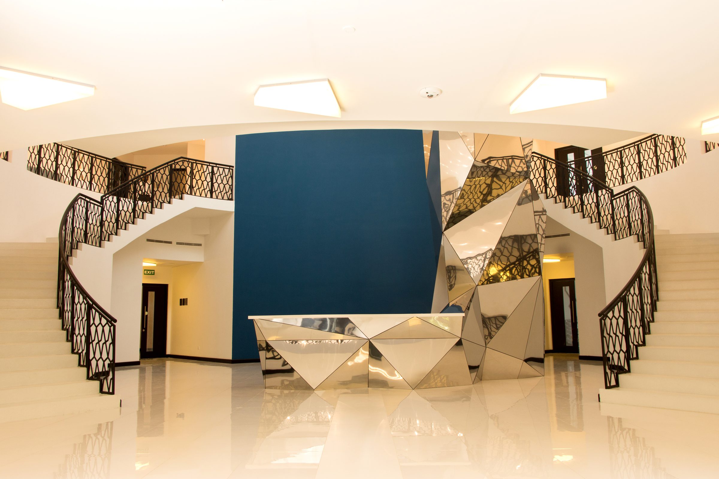
The tower’s stacked, cantilevered silhouette, which she first read as an archaeological puzzle, traces back to a single drawing based on guardstones and moonstones: the carved stones that mark sacred thresholds in ancient Sinhalese architecture. The structure, the glass and the detailing all grew out of that one sketch, positioning the building as a marker for the Colombo still to come.
A sun in the lobby
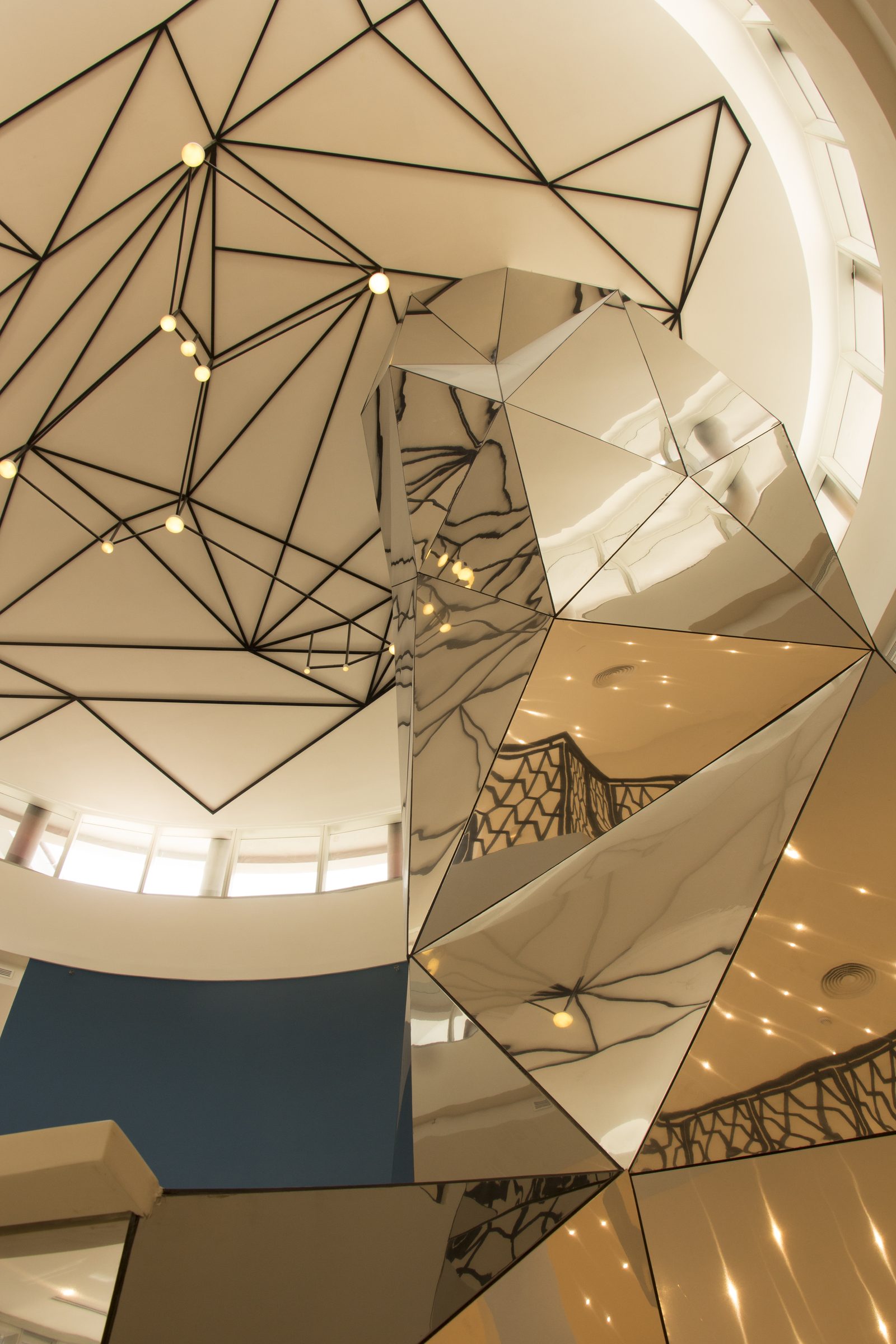
The lobby’s centrepiece is a rising sun: a composition five storeys high and 200 metres deep, made from eight different materials. For Punjabee, James was one of the artists still at work on the canvas.
“Paint still on his fingertips. Sketches still in his pocket.”
Art on every wall
Contemporary Sri Lankan art, curated by Saskia Fernando Gallery, runs right through the property, turning a walk to breakfast into a gallery visit. She singles out Gayan Prageeth’s Before Nineteen Eighty Three, an eight-foot inverted bucket that looks at profiling, memory and the transformation of the Jaffna Peninsula.
Sri Lankans, brought home
Over lunch with CEO and general manager Sanjiv Hulugalle, she learns that John Keells Holdings made a point of bringing Sri Lankan hospitality talent back from around the world to lead the project, and that pride shows in how the place is run.
The rooms, and the city
The rooms are calm and confident: white, cool marble, measured bursts of colour, and curtains that open onto the ocean at the touch of a button. Her advice is to step out anyway: walk the promenade to Galle Face and watch Colombo putting itself back together around the building.
A summary of “Colombo’s new icon of architecture and art” by Yashika Punjabee, ELLE Decor India, 28 May 2025.
Daily Mirror · Life · Interview
Architectural alchemy.
The magic and the method of designing Cinnamon Life.
4 November 2024 · James Balmond in conversation
For the 15th Sri Lanka Design Festival, staged at the newly completed Cinnamon Life, James sat down with the Daily Mirror to talk through how the building came to be: from the first sketch to the façades, Balmond Studio’s long collaboration with Aod, and how much of Cecil Balmond’s original vision made it into the finished building.
Where it starts
I wish I could give you a simple answer here. But the truth is that there’s no definitive singularity – a consistent point of departure. Conceptual beginnings change with each project. We have a purpose; make a building. Yet the solution is unknown. But we need to start somewhere.
At the very beginning, conceptual thinking isn’t chronological – A leads to B leads to C. A neat chain of causality. Rather it is non-linear. An amalgamation of instinct and intent, context and experience, knowledge and abstract thought, the conscious and the subconscious.
All these factors engage with one another in the brain. It’s a mysterious process beyond our understanding, leading us to creative action. When the time is right, spontaneous instruction flows from the mind to the hand as we put pen to paper. In this first sketch, there’s no brief. No sense of legacy. No predeterminism. Only interpretation in one specific instant. The moment is like a Big Bang – creating something from nothing. We have the seed of an idea.
The moment is like a Big Bang – creating something from nothing.
The initial concept for Cinnamon Life emerged from this same mysterious alchemy. There were many tangible and intangible influences driving Cecil Balmond’s thinking. I can’t unpack them all here; so let’s focus on context and place. The site sits at a meeting of the city to the east and sea to the west. The ascension of the urban sprawl. The expansion of the horizon. Colombo’s diversity and dynamism. The ambition of the John Keells Group. The building had to encompass all these dynamic elements. Evolution, change and the kinetic were paramount. So inert form was redundant. We had to think in terms of a moving geometry. Architecture had to be animate.
The first sketch for Cinnamon Life was conceived as a symphony of energy. A single line travelling in a series of vertical and horizontal extensions. A building of holistic motion.
Architecture meets the city
As I previously mentioned, we distilled the idea of vibrancy and diversity into one idea – movement. So how does motion manifest in the architecture?
To capture the energy of Colombo, we required a new conceptualisation of form. We needed animation and movement, autonomy and interdependence, as well as singularity and multiplicity.
Serialisation of form was the solution. This involves the integration of multiple synergetic forms within one development. Think individual moments within a holistic scene. The strategy is kinetic by default. But it isn’t random. Every form moves as part of a sequence – engaging with, and feeding back into, another form. Static frames replaced by geometric flow. Much like a symphony, we have individual movements transitioning into each other to create an overall musical composition.
The form of Cinnamon Life takes inspiration from a meeting of city and water. From a structural perspective, we engaged with verticality to reflect the built environment and horizontality to echo the sea. The building’s power lies in the interaction and exchange between these two types of spatial movements – a cycle of continuous feedback. Architecture as infinite motion.
Architecture as infinite motion.
The façades
The facades provide a secondary pulse to complement the animate architecture. We wanted to create unique façades with distinct personalities. However they also had to have unity. This methodology is another interpretation of the serialisation of form. We have individual, and yet interdependent façades, interacting with one another to create one picture.
To achieve our objective, we created a fixed material palette, with an evolving application of these materials through the different façade configurations. The strategy produced unique complexity with overall cohesion.
We distilled façade into three base elements, comprising pattern, glass and solid material (either aluminium, stone or mesh). For each façade, we kept two of the elements and altered the third. By doing this, we see an evolving façade language, developed from a common source. The patterns are algorithmic in nature, growing, iterating and evolving. Dynamic city. Dynamic form. Dynamic facades.
Working with Aod
Balmond Studio and Clan B have been involved with Aod for many years. Our relationship is based on a shared vision; to cultivate and elevate design here in Sri Lanka, whilst simultaneously raising awareness of the Sri Lankan design capacity internationally. The connection between our two organisations is based on knowledge exchange and strategic alignment – a potent mix for sure. Internships, crit sessions, lectures, design projects – we’ve achieved a lot together. So we’re thrilled to be involved in the 15 year anniversary of the SLDF too! Linda and the entire Aod team have created something extraordinary, and we’re delighted to have made a small contribution to that success.
What to take away
To be honest; all I want is for everyone to obtain a clearer understanding of Cinnamon Life – from its nature and narrative, to the aesthetics and composition. Balmond Studio is there to illuminate the intention behind every detail and decision. Whether you like it or not is totally up to you. Everyone has their own opinion and we don’t have the right to dictate that. But I hope, with a little knowledge, people will obtain a greater comprehension and potential respect for this incredible project.
Cecil’s vision
Cinnamon Life is the manifestation of many minds. An amalgamation of ideas. John Keells Group had their overall vision for the project. Cecil’s conceptual interpretation of the brief was synergetic. So the vision becomes shared to a degree. And of course, everyone from senior architects to structural engineers believes in the vision too. This is the only way to pull off a job of this size.
We often see a disparity between initial renders and the built reality. But in the case of Cinnamon Life, they are uncannily similar. This is a testament to Cecil’s vision being realised. I have had many discussions with him regarding the project and what I can say is that his intention and conceptual purposes are all there. The serialisation of form, animate architecture to capture the dynamism of place and a building with no conventional front and back – all these elements are inherent within the building’s very nature.
First published in the Daily Mirror (Life), 4 November 2024.
 James Balmond